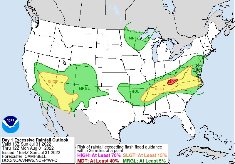
The official snow outlook is less about one dramatic seasonal total and more about shifting probabilities for heavy snow. Here’s how to read the map before winter storms start shaping travel, power and school decisions.
Winter snow map interest is rising because a U.S. winter snow forecast map from the National Weather Service and NOAA is the clearest way to see where snowfall is expected to be heaviest this winter across America and the United States. The official snow outlook does not promise one fixed seasonal total; it forecasts heaviest snowfall risk through probability maps.
That matters because the places that look most vulnerable on a snow map can shift quickly as storm tracks, cold air and moisture line up. For drivers, homeowners, school districts and travelers, the useful question is not just who gets snow, but where the odds of disruptive snow are highest.
The map is about odds
NOAA’s Weather Prediction Center, part of the National Weather Service, publishes winter weather forecasts that show the probability of snow reaching or exceeding specific amounts. In plain English: the darker or higher-probability zones are where forecasters see a better chance of snow piling up to meaningful thresholds.

The WPC describes its snow products as probability maps, not guarantees. Its winter weather page lists snowfall probability forecasts, freezing rain probability forecasts, composite charts and a Day 4-7 outlook. It also points users to official NWS 6-hour snow accumulation forecasts.
That distinction is important. A map showing elevated odds for 8 or 12 inches does not mean every neighborhood inside the shaded area will get that amount. It means the atmospheric setup supports that possibility strongly enough for forecasters to flag it.
Where heavy snow usually clusters
The hardest-hit parts of the United States in winter snow setups are often the regions where cold air, elevation or lake-effect moisture can make storms more efficient. That puts the mountain West, the northern Rockies, the northern Plains, the Upper Midwest, the Great Lakes snow belts and parts of the interior Northeast among the areas to watch when national snow maps light up.
Western mountain ranges can wring heavy snow out of Pacific moisture. The Great Lakes can boost snowfall when cold air passes over relatively warmer water. The northern Plains and Upper Midwest can see large accumulations when strong systems track across the central U.S. with enough cold air in place.
The interior Northeast and higher elevations of the Appalachians can also become heavy-snow zones when coastal or inland storms track favorably. A small shift in the rain-snow line, however, can separate a foot of snow from a cold rain or messy mix.
What the official outlook shows
The WPC’s winter forecast products are built around thresholds. According to NOAA’s WPC winter weather page, preliminary snowfall forecasts include specific accumulation levels for Days 1-3, including 1, 2, 4, 6, 8, 12 and 18 inches. Final forecast panels emphasize the probabilities of snow reaching or exceeding 4, 8 and 12 inches.
That format is useful because impacts do not rise evenly. One or two inches may slow a commute in a warmer city with fewer plows. Four inches can snarl untreated roads. Eight or 12 inches can affect interstates, airports, power crews and emergency response.
The same page includes freezing rain probabilities, including the chance of reaching or exceeding a quarter inch of ice. That is a different hazard from snow, but often part of the same winter storm decision-making. A region outside the heaviest snow zone may still face serious trouble if ice is the dominant risk.
Seasonal maps need caution
The phrase “this winter” can make a snow map sound like a firm seasonal verdict. Officially, the most actionable NWS snow maps are short-range and medium-range tools. They are designed to help people understand the next storm window, not to lock in a whole season of snowfall months in advance.
Seasonal outlooks from NOAA can show broader odds for temperature and precipitation patterns, but snowfall depends on timing. A wetter-than-normal pattern does not automatically mean more snow if warm air dominates. A cold pattern can still underdeliver if storms track too far south, too far north or dry out before reaching a region.
That is why meteorologists often separate pattern risk from storm risk. A winter may favor certain corridors overall, but the biggest totals still come from individual storms with just the right overlap of cold air and moisture.
Why small shifts matter
Snow forecasts are famously sensitive to storm track. A low-pressure system that moves 50 miles farther west can pull warmer air into a city that looked snowy a day earlier. A track 50 miles east can move the heaviest snow band away from a major metro area and into rural counties.
Lake-effect snow is even more localized. A narrow band can bury one town while another nearby community gets flurries. In mountain terrain, elevation can create sharp differences over short distances, especially when temperatures are near freezing.
This is also why the official probability approach is more honest than a single deterministic number. It shows uncertainty instead of hiding it. The public may want one answer, but winter storms rarely behave that neatly.
How to use the map
The best way to read a winter snow map is to look for three things: the threshold, the probability and the timing. A 60% chance of at least 4 inches is not the same as a 20% chance of at least 12 inches, even if both appear on a national snow graphic.
- Check the threshold: Is the map showing 1 inch, 4 inches, 8 inches or 12 inches?
- Check the time window: Is it a Day 1-3 forecast, a Day 4-7 outlook or a broader seasonal signal?
- Check local updates: Local NWS offices refine timing, impacts and warnings as storms get closer.
- Watch the rain-snow line: Areas near freezing can see the biggest forecast changes.
The clean takeaway: the winter snow map is a warning tool, not a crystal ball. It can show where America could get hit hardest this winter, but the most reliable guidance comes when NOAA and the National Weather Service narrow the forecast from national probabilities to local impacts.
Leave a Reply